

Mobile Design
Digital Marketing Tip – Choosing the Right WordPress Theme
One of the easiest ways that you can inject a bit of speed into your WordPress website is to choose a fast theme. These are the factors you need to take into consideration…
One of the easiest ways that you can inject a bit of speed into your WordPress website is to choose a fast theme. Using any old theme can severely impact your website and not in a good way.
Unless you are an old-hand at WordPress or a developer, you may not know what you need, especially if you are intending to purchase a theme rather than using a freebie.
These are the factors you need to take into consideration:
Buy Only What You Need
By the time you get to choosing a theme, your website content should be planned out, so you have some idea of what you need – if it isn’t, so it now before you go any further.
If you don’t, you will end up purchasing a theme that is ‘multi-purpose’, simply because you have no idea what you need. This will not do anything for website speed.
Also, keep in mind that you will likely be adding plugins too, so your theme really needs to be as lightweight and fast as possible.
Speed Testing the Theme Demo
All themes will have a demo site to show you what it looks like. Speed test the demo using something like GTMetrix or Pingdom tools and make sure you test multiple pages, not just one.
It isn’t easy to say how fast it should be but, if you have a website that has a lot of content, i.e. loads of sections, images, etc., you want it loading in less than 3 seconds, preferably less than 2.
Speed will also vary for different test locations, the location the demo site is hosted from, whether a CDN is in use, caching and so on. Test a few themes and, on the information, you have available, you will be able to see whether there are any that are faster than others.
HTTP Requests
The number of HTTP requests equates to how many times the browser asks the server for images, CSS, and other files – the higher the number the longer the process takes.
Ideally, you want a low number of requests to keep the speed up. A web server is capable of serving multiple requests so around 60 requests shouldn’t take so long but, push that number up to 80 or higher and you start to see a significant slowdown.
Page Size
In simple terms, if you have a lot of data on your webpage, the longer it is going to take to download. Data incudes information, images, posts, etc. and each page is measured in KB and MB. Generally, you want to aim for less than 1 MB. Go beyond 2 and you will start to have problems with speed.
Some people tend to cram as much information as they can onto one page of their website and all they are doing is slowing down the load times and irritating their website visitors to the stage where they my just up and leave.
What You Can Control
When you start to look at themes for your WordPress website, you need to know what aspects you can control. Some themes will let you leave the widgets off the sidebar, for example, which will speed load times up.
Many people see the demo of a theme and want to recreate it but, if you are careful, if you make choices that are more speed-conscious, you could have a great looking site that loads super-fast without losing any of the content or information.
If you use Pingdom, have a look at the Page Analysis. In particular, look at how much CSS and JS is loaded and how many images there are, as well as their overall size.
You can control the images because you use your own and you can compress them before you upload them With CSS and JS, however, you don’t get that control.
This is inherent to the theme you choose, and you can only hope that, should you disable a specific feature that the JS files relating to that feature will not be loaded – you can’t possibly know that before you use the theme though. Assume, therefore, that the size of the JS and CSS are pretty constant.
WordPress Theme Recommendations
Choosing a theme is not easy but it is important to get the right one; here are some theme shops we have worked with and fully recommend:


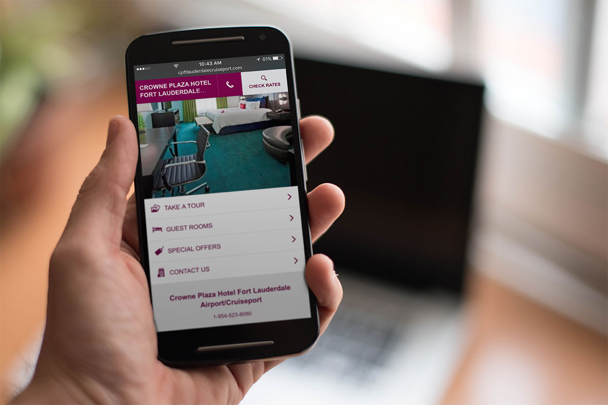
Mobile use is more prevalent now than it has ever been, and more people are using their smartphones or tablets to access websites. No matter how good it is, their mobile data connection is never going to be fast enough o cope with a full-size website.
Of course, some would say that your website should have a ‘responsive’ design, a word that implies mobile-readiness but is rarely what you get.
Generally, a responsive website design just means that your desktop content gets shifted around a bit, perhaps converting three columns of content into one that has three rows, but this won’t improve loading speed. In some cases, it can make it a good deal worse.
Why? Because you are still trying to give mobile and desktop visitors the same content but in a slightly different format.
Let’s say that you have an image carousel of 5MB. That’s great for someone on a computer that has a retina screen but for a mobile user in, say India, that’s going to take around 10 minutes to load up!
The ideal solution is to show your mobile visitors different content with a better design and faster loading. Sadly, this is not quite so easy as using a CSS media query and visibility:hidden or display:none to hide your content.
Your page will still load up that content it just won’t show it. So how do we do this?
Mobile Detect Shortcode
You can add shortcode to your site using a plugin called WP Mobile Detect. This will help you to hide or show specific content.
For example, let’s assume that you have a post with a big infographic; you need your desktop visitors to see this as it is crucial to the post.
By using the plugin, this infographic could be wrapped in a shortcode, so it will only be seen on a desktop. For the mobile visitors, you add a link to the post that they must click to see the full image.
The first example shows a sample of code for a desktop visitor, the second for mobile visitors:
Example 1
[notdevice]
‘<img class=”my-large-infographic-image” src=”http://mysite.com/large-image.jpg” />’
[/notdevice]
Example 2
[device]
‘<a href=”http://mysite.com/large-image.jpg”>Click here to download the infographic.</a>’
[/device]
Doing this can make mobile loading times much faster while still giving them the opportunity to see the large image.
wp_is_mobile()
This is a function that lets you detect devices using your plugin or theme. It is generally used for dequeuing styles or scripts that are not necessary for mobile loading or in page templates to stop large images being served. For example, this is how you remove a large image from the header for mobile:
<?php if( !wp_is_mobile() ) : ?>
<img class=”my-large-header-image” src=”http://mysite.com/large-image.jpg” />
<?php endif; ?>
</header>’
This will detect a device based on the user agent and, despite what some people think, it isn’t useless with caching. Good hosts can cache mobiles separately, so you should continue to use functions that are mobile-specific.
A Separate Site for Mobile
You could also use a separate website for serving content to a mobile device and you would do this using an m.subdoman, something like m.appresser.com. When a mobile user tries to go to your website they will be redirected to a mobile version.
This does, of course, mean you have two websites to manage and keep the parity between both of them simultaneously.
Typically, a mobile user will want the functionality that your desktop site has but on a smaller screen so, instead of removing features, keep them in but speed them up and make them more accessible.
And, because making your desktop site faster will make your mobile site faster, make sure you follow all our tips for a faster WordPress site.

13 Steps To Building A Profitable High Traffic Technology Blog – Part five – WordPress Hosting
13 Steps To Building A Profitable High Traffic Technology Blog – Part Four – your logo

Who approved never get Hulu as an ad slogan?

13 Steps To Building A Profitable High Traffic Technology Blog – Part Three – the baby business plan

A Failure of imagination – Apple release new iPhone XR iPhone XS and iPhone XS Max
-

 Website Performance8 years ago
Website Optimization Tips – Optimizing the Order of Styles and Scripts
-

 Web Content9 years ago
How to test a copywriter
-
 Website Performance8 years ago
WordPress Performance Tips – Enable Keep Alive
-

 Research and SEO11 years ago
New Google Penguin Algorithm Update Being Rolled Out
-
 Digital Marketing Training7 years ago
13 Steps To Building A Profitable High Traffic Technology Blog – Part five – WordPress Hosting
-
 Digital Marketing Training7 years ago
13 Steps To Building A Profitable High Traffic Technology Blog – Part Four – your logo
-

 Web Content12 years ago
7 Basic Principles Of Good Writing
-
 Digital Marketing Training8 years ago
13 Steps To Building A Profitable High Traffic Technology Blog – Part Three – the baby business plan