
Featured
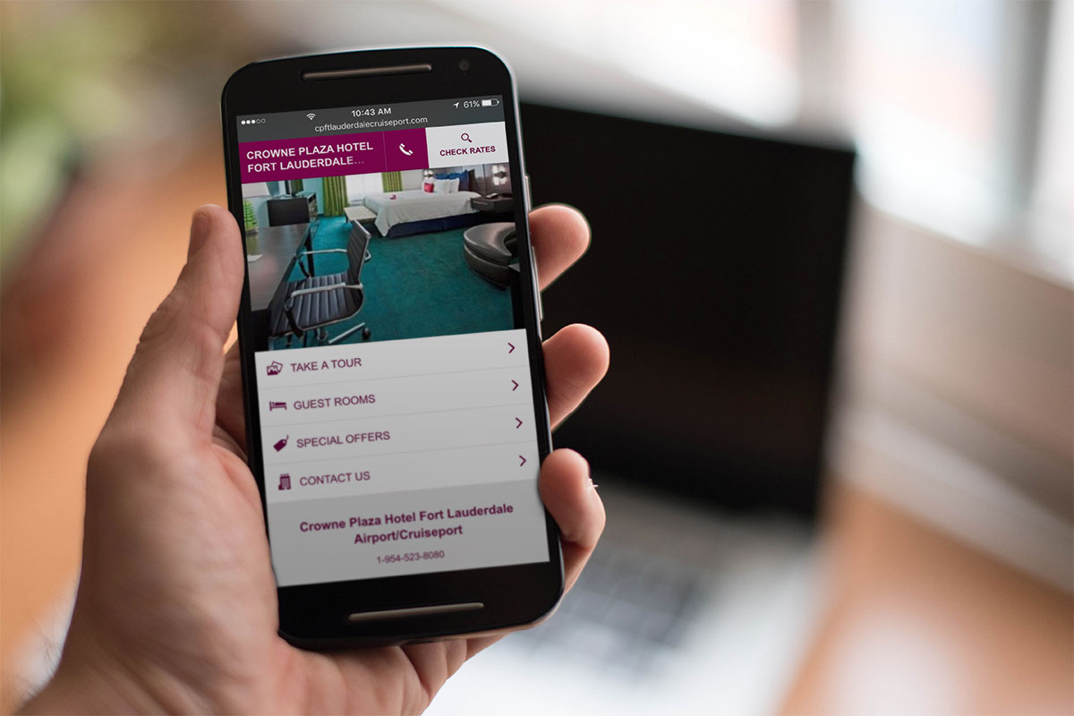
Serve Your Mobile Customers with Different Content
Mobile use is more prevalent now than it has ever been, and more people are using their smartphones or tablets to access websites. No matter how good it is, their mobile data connection is never going to be fast enough o cope with a full-size website.
Of course, some would say that your website should have a ‘responsive’ design, a word that implies mobile-readiness but is rarely what you get.
Generally, a responsive website design just means that your desktop content gets shifted around a bit, perhaps converting three columns of content into one that has three rows, but this won’t improve loading speed. In some cases, it can make it a good deal worse.
Why? Because you are still trying to give mobile and desktop visitors the same content but in a slightly different format.
Let’s say that you have an image carousel of 5MB. That’s great for someone on a computer that has a retina screen but for a mobile user in, say India, that’s going to take around 10 minutes to load up!
The ideal solution is to show your mobile visitors different content with a better design and faster loading. Sadly, this is not quite so easy as using a CSS media query and visibility:hidden or display:none to hide your content.
Your page will still load up that content it just won’t show it. So how do we do this?
Mobile Detect Shortcode
You can add shortcode to your site using a plugin called WP Mobile Detect. This will help you to hide or show specific content.
For example, let’s assume that you have a post with a big infographic; you need your desktop visitors to see this as it is crucial to the post.
By using the plugin, this infographic could be wrapped in a shortcode, so it will only be seen on a desktop. For the mobile visitors, you add a link to the post that they must click to see the full image.
The first example shows a sample of code for a desktop visitor, the second for mobile visitors:
Example 1
[notdevice]
‘<img class=”my-large-infographic-image” src=”http://mysite.com/large-image.jpg” />’
[/notdevice]
Example 2
[device]
‘<a href=”http://mysite.com/large-image.jpg”>Click here to download the infographic.</a>’
[/device]
Doing this can make mobile loading times much faster while still giving them the opportunity to see the large image.
wp_is_mobile()
This is a function that lets you detect devices using your plugin or theme. It is generally used for dequeuing styles or scripts that are not necessary for mobile loading or in page templates to stop large images being served. For example, this is how you remove a large image from the header for mobile:
<?php if( !wp_is_mobile() ) : ?>
<img class=”my-large-header-image” src=”http://mysite.com/large-image.jpg” />
<?php endif; ?>
</header>’
This will detect a device based on the user agent and, despite what some people think, it isn’t useless with caching. Good hosts can cache mobiles separately, so you should continue to use functions that are mobile-specific.
A Separate Site for Mobile
You could also use a separate website for serving content to a mobile device and you would do this using an m.subdoman, something like m.appresser.com. When a mobile user tries to go to your website they will be redirected to a mobile version.
This does, of course, mean you have two websites to manage and keep the parity between both of them simultaneously.
Typically, a mobile user will want the functionality that your desktop site has but on a smaller screen so, instead of removing features, keep them in but speed them up and make them more accessible.
And, because making your desktop site faster will make your mobile site faster, make sure you follow all our tips for a faster WordPress site.
Editorial
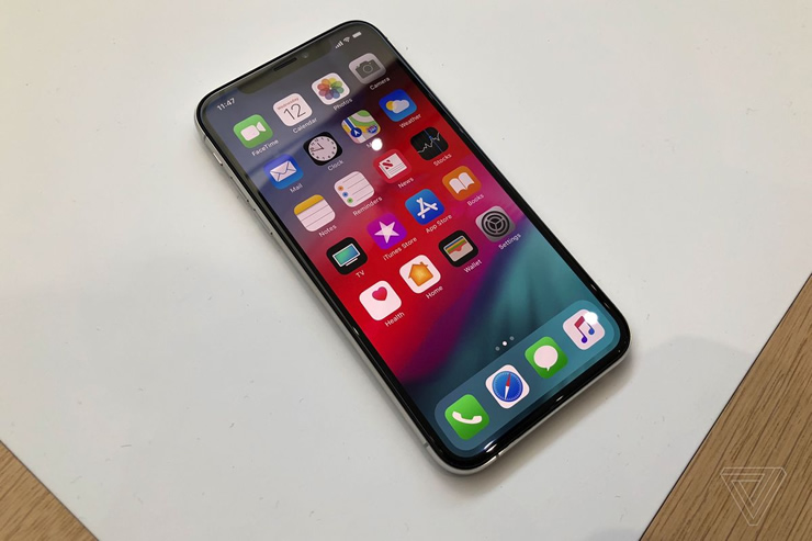
A Failure of imagination – Apple release new iPhone XR iPhone XS and iPhone XS Max
Apple have taken the easy way out, avoided innovation and are dependent on incremental upgrades

I have an iPhone and I love it so I absolutely hate to be THAT guy.
I hate to be the guy who’s going against the grain, who seems to be contrarian where others celebrate but unfortunately, this is one of those articles.
Apple released their new iPhones today.
They released three new models – the iPhone XR, iPhone XS and iPhone XS Max.
The new iPhone XS and XS Max are priced at $999 and $1,099 and start shipping out at the end of this month. The iPhone XR starts at $749 and begins shipping out in October.
The iPhone XS has a 5.8-inch OLED display with a 2436 x 1125 resolution. Meanwhile, the iPhone XS Max has a 6.5-inch OLED display with a 2688 x 1242 resolution. The iPhone XR, which you can basically think of as this year’s lower-end offering, has a 6.1-inch LCD display with a 1792 x 828 resolution.
At the end of the day, the screen size is the main difference between these three new models.
- The XS is smaller than the iPhone 8 Plus but the screen is as big as the screen on the 8 Plus.
- The iPhone XS Max is as big as the iPhone 8 Plus, and its screen is larger.
- The iPhone XR has a larger display than the iPhone 8 Plus, while its overall size is just slightly smaller.
The iPhone XS and XS Max have dual rear 12-megapixel cameras and improved True Tone flash, and a front 7-megapixel camera. The iPhone XR, as the more budget option, has one 12-megapixel camera on the back, with True Tone flash.
All the new phones are powered by a new seven-nanometer A12 Bionic chip which can handle 512GB of storage. The iPhone XS and XS Max also have faster Face ID, True Tone display, and 3D Touch. They have support for Dolby Vision and HDR10 video.
The iPhone XS and XS Plus come in gold, silver, or space gray. The iPhone XS starts at $999 for the 64GB option, and has 256GB and 512GB options as well. The iPhone XS Max starts at $1,099, with the same storage options. The 512GB option goes for $1,449.
The Apple iPhone XS Promo Video
My opinion
Unfortunately, this is just more of the same.
Apple have made a larger phone, added more storage and made the camera better. The phone OS will be improved as well but that is really all that happened.
As someone who has an iPhone 7 Plus, I will upgrade at some point but the truth is there is STILL no rush.
I have been waiting for a compelling upgrade from Apple that would force me to head to the store and/or pre-order a new phone and the truth is, this isn’t the one.
The Samsung Galaxy Note 9 seems way more exciting from a consumer point of view because of the screen, the pen and the TONS of innovative new features they bring to the table.
When Steve Jobs died, there was a fervent argument among the faithful that innovation at the worlds most valuable company would start to slow.
Unfortunately I fear this is the case.
The most exciting features of the iPhone (IMHO) are FaceID and the upcoming multi-user FaceTime. Beyond those two features, it seems like Apple is just keeping up with the competition.
Let’s be really clear, these are REALLY GOOD PHONES.
But unfortunately, Apple is in a Michael Jackson type situation where they seem to be unable to do anything better than their greatest hit.
Apple continues to live in Steve Job’s shadow and unfortunately, his genius is really the anchor against which the company’s level of innovation will be measured. Using that yardstick, the company fails to measure up.
Preorders for both phones begin on September 14 and ship on September 21st in select countries, with rollout in other countries to follow.
What do you think? Will you buy an iPhone XS?
Featured
Serve Resources from Consistent URLs

No doubt, if you use a tool like GTMetrix, you’ve seen a warning telling you to serve your resources from consistent URLs. The warning will tell you that the resources listed have got identical content in them but are not being served from the same URLs.
Serving from consistent URLs not only saves resources and time on fewer requests, it can also save in bandwidth.
Why Does This Happen?
All websites use resources like JS files, CSS files, images and so on to deliver the right layout, the right functionality and a better user experience. Every resource is individually called by a browser when the webpage is accessed, and these are called HTTP requests.
Most of the time, each of the resources are served from one URL but, on occasion, a resource may be available through several domains or hostnames. That means that, when that page is loaded, it gets called several times and downloaded several times, once from each URL. This causes slower page loading.
This tends to happen when a resource is shared between multiple sub-directories or sub-domains on the same website or, sometimes when multiple plugins use the same eternal resources or libraries.
In short, it is down to redirects that have not been properly implemented, the wrong settings in your CDN or even a bug inside the theme you use. This all results in multiple HTTP requests, multiple downloads and even multiple DNS lookups, all of which have a negative effect on SEO and on page speed.
How Do You Serve Resources from Consistent URLs?
The four main situations that result in duplicate resources are:
- When there is an HTTP and an HTTPS version of a website
- When two websites share the same resources
- When two or more plugins are sharing resources
- When a CDN hosts resources and those resources can be accessed through the origin server and the CDN
And the methods to solve this issue are:
Move
The commonest issue is resources shared between several linked sites or subdomains. The solution is for the filename to be served from one hostname and linked to from the other. Although an extra DNS lookup is needed, the benefits reaped from caching make it worthwhile.
Rewrite
When you use a CDN for speeding up your website, you may get duplicate resources usually caused by the way that your plugins or theme handle the static resources. Normally you would edit the URLs for the static resources manually or through a plugin, thus moving them to the CDN.
Most of the time, this goes smoothly but sometimes a plugin or theme will pull some of the files out of the media library, into the code. The solution is to go into your theme’s files and change the path so that it points to the CDN file.
Doing it manually is not the best way; instead, go into the header.php file and find the line that defines the path the content, usually a logo, and edit it so it matches the CDN resource.
Redirect
If your website is available at two different addresses, such as mysite.com and www.mysitecom, you may end up with duplicate resources. Although you might have a good reason for having your website constructed in this way, you do end up with two websites.
One is hosted on the domain root and the other on the subdomain. The solution is to choose the main website and use 301 redirects sitewide. This will tell browsers and search engines to forget the other versions and go straight to the main site.
Canonical Tag
You can also use canonical tags to consolidate resources, useful for e-commerce sites where multiple pages may point to a single resource using different attributes or categories. In all honesty, a canonical tag shouldn’t be your first choice if you can use redirects instead. Rather than removing duplicate resources, canonicals just tell a search engine to prefer a specific version of your content
To implement a canonical tag, add the link to the resource you want into the code of the duplicate resource using the canonical attribute of rel=.
Plugins
Sometimes the issues will be caused by several plugins trying to share a resource or one plugin adding a string, like ?dshd=343, for example, to the original URL. The best way to solve this is to deactivate one or more plugins.
You can’t control a plugin because it is a third-party product so all you can do is deactivate. To see which one/s need to be deactivated, turn the settings off for each one and then on again to see which cause the problem.
Whichever solution works for you will result in your website speed increasing and fewer resources being used.
Caching
Specify a Cache Validator

Cache validators are defined inside response headers and HTTP requests and are used to determine if whether or not a request to retrieve files from the browser cache are valid.
These validators are important because they work out whether a request needs to be sent to the server, which uses more resources and takes longer, or if the required files can be got from the local cache, thus increasing loading speed and using less resources.
It is always going to be better to retrieve files from the browser cache because it doesn’t involve the round trips that requests to the server involve. Using a cache validator, like an etag header or Last-Modified, can help to ensure that the browser is using caching as efficiently as possible.
How to Specify a Cache Validator
When you use a we serve, such as Nginx or Apache, the Last-Modified header is included by default. When your page speed tool, like GTMetrix or Google Page Speed, come up with the suggestion that you specify a cache validator, you are required to use either Last-Modified header, Etag and Expires Header or Cache Control Max Age header.
Last Modified and Etag headers are used for assisting the browser to work out if the requested file has been altered in any way since it was requested last. Cache Control and Expires header are used for working out how long a file should be stored in the cache before a new copy is requested from the server.
If you don’t use the Expires or Cache control headers, the browser has no way of knowing how long a local cached copy should be stored before a new one is retrieved. These may already have been defined on the server you use but, if you need to define them manually and you use Nginx or Apache, you can use these code snippets:
Apache
<filesMatch “.(ico|pdf|flv|jpg|jpeg|png|gif|js|css|swf)$”>
Header set Cache-Control “max-age=84600, public”
Nginx
location ~* \.(js|css|png|jpg|jpeg|gif|ico)$ {
expires 2d;
add_header Cache-Control “public, no-transform”;
}
If you wanted to add the Last Modified header straight into a dynamic file, you would need to use the gmstrftime from the PHP file, as in the next example:
header(‘Last-Modified: ‘ . gmdate(‘D, d M Y H:i:s’) . ‘ GMT’);
On occasion, you may be trying to load resources stored on another domain. In this case, your speed test tools would send you a notice that you are required to specify a cache validator for those resources.
You could ignore this notice in safety – just like assets that are loaded from fonts.googleapis.com, for example, you do not have control over setting any cache validator for the resources and there is always a chance that what was specified has been intentionally removed.
Browser caching is a very important factor in WordPress website speed and making sure that you specify the right cache validator, and that it works as it should do, is critical for ensuring that browser caching is being used efficiently and results in speedier page loading.
-

 Website Performance8 years ago
Website Optimization Tips – Optimizing the Order of Styles and Scripts
-

 Web Content9 years ago
How to test a copywriter
-

 Website Performance8 years ago
WordPress Performance Tips – Enable Keep Alive
-

 Research and SEO11 years ago
New Google Penguin Algorithm Update Being Rolled Out
-

 Digital Marketing Training7 years ago
13 Steps To Building A Profitable High Traffic Technology Blog – Part five – WordPress Hosting
-

 Digital Marketing Training7 years ago
13 Steps To Building A Profitable High Traffic Technology Blog – Part Four – your logo
-

 Web Content12 years ago
7 Basic Principles Of Good Writing
-

 Digital Marketing Training8 years ago
13 Steps To Building A Profitable High Traffic Technology Blog – Part Three – the baby business plan

