
Maintenance
5 Common Contact Page Mistakes To Avoid
Contact page. Chances are that it is probably the shortest page on your website or websites, but there is no doubting its significance. On potential alone, it could be the most important page on your site.
Clients, customers, regular readers, influential bloggers, advertisers, other businesses may stop by to read one of your posts or pages, and want to contact you. If you do not have contact information easily visible, and satisfyingly set up, these people may move elsewhere.
Even if your contact page is easy to find, you have to ensure that you do not put off your readers by making some common mistakes. Mistakes like:
Not having a contact page
Surprising as it may sound, some people like to bury contact information at the bottom of their homepage, or in a corner somewhere on a sidebar. Bad idea. Not only should you create a separate contact page, make sure that it is visible in the navigation menu.
Lack of contact information
What good is a contact page, if it lacks essential information? Yeah, don’t answer that. Sure you can just stick in a contact form, but not all readers like to get in touch via forms. Be approachable and include your email address. In fact, include as many contact details that you can.
A broken contact form
Forms don’t always work. Even the best designed form, with options and dropdown menus may break due to an update you installed, or an error in the code. Frustrating. Even more infuriating is when no error message is displayed, and people suspect whether the message got through. Test forms regularly.
Not linking your social accounts
If you have an active social presence, then your contact page is a great way to not just showcase it, but also link to these accounts. Sure you have all those fancy social buttons in your sidebar, but not everyone might be this attentive. Link your most active social profiles on your contact page.
Outdated information
When was the last time you visited the contact page on your website? Or multiple websites? Not very often, one might assume. Make it a point every month to check for any outdated information when you test your contact forms. Particularly, if put up temporary messages and stuff like that.


If your website, or websites, are performing poorly, then it’s often not that hard to pinpoint the areas that are holding them back from being in top shape.
Sad reality is that a lot of websites these days fall into this category.
And it’s not just got to do with broken links, error messages, images that aren’t displayed, or even pages that have lost their formatting. Web technology and the tools required to create websites constantly evolve, and it’s not uncommon for even carefully maintained sites to fall sick, if you may.
There may be a small selection of things that may be wrong with your website, and the surprising factor here is that you may not even know about them.
Here are 4 defining indicators of a poorly performing website:
You can’t make changes on your own
If you need the help of a developer to make the simplest of design or content changes on your site, then you’re asking for trouble. These days it’s more important than ever to have websites that are constantly updated with fresh content.
Search engines like Google pay attention to how frequently fresh content is created, and you guessed it, sites are ranked accordingly. Work out a way so you can make minor changes yourself, unless you plan on falling behind your competition.
Static web content
Dynamism is the call of the hour, these days. Static web pages mean that the content your website visitors see stays the same no matter how many times they visit. Yes, that’s how sites used to work since the creation of the web — HTML files and all.
But fact is that dynamic content has a notable impact on the overall ROI of website or online business. Serving personalized content always leads to better conversions and higher engagement numbers. Interesting fact is that only 19% of the websites actually do this — the rest are statically static.
Slow load times
This is a popular one! There’s no shortage of resources claiming just how important speed is for your websites or blogs. A recent study by Brand Perfect showed that an overwhelming 67% of consumers abandoned websites and online sales because of slow loading pages.
On the other side of the equation, Google has made it clear long ago that the speed of your website affects it search engine rankings. So not only are you losing customers, you risk not attracting visitors.
The solution is simple, really.
If you can opt for it, go with a Content Delivery Network (CDN), which, instead of storing your website content on a single server, distributes it across data centers across the Internet. If you can’t, then at the very least, choose fast hosting, preferably hosting packages with solid state drives (SSD).
Not optimized for multiple devices
Responsive site design, another buzzword that you surely must have heard by now. This is no longer a luxury, it is essential for websites to be optimized for mobile devices, tablet or smartphone. And not just optimized in terms of content and layout, but speed as well.
The last thing you want to do is to keep your mobile users waiting!
So make sure you server the right versions of your sites to users by utilizing a responsive design and a fluid layout that automatically adjusts to the type and form factor of the device it is viewed on.

Although internet speeds have improved around the world in the past decade, heavy downloads are still an issue for a lot of people with sketchy bandwidths or slow computers.
And that’s not even bringing SEO and mobile usage into the picture.
Even with such apparent limitations, most images for the web are typically not optimized to reduce file size while maintaining quality. Most people (and some) graphic designers still don’t use the optimum settings when outputting their final images.
Having large images does not mean their file size has to be large too!
Here is a concise list of some of the immediate advantages of using image compression for websites, and reducing the file sizes of the images, photos and art on your website or blog:
Faster load times
No one says no to a quick loading site. Compressing your images down ensures a superior experience for your visitors, users and readers where they won’t get frustrated. It also makes sure your audience engages with your website longer.
Improved search rankings
It’s no secret that Google loves faster sites. Squeeze as much data off of your site or blog to make it load faster, increasing your organic search rankings along the way.
Better conversion rates
Faster sites convert better. Logic. You don’t risk losing buyers and subscribers this way, while they are waiting for the images to load on your signup page.
Enhanced inbox placement
If you are feeding images from your site to your emails and newsletters, your messages run the risk of landing in the junk folder. The last thing you want, really.
Easier migration
Web hosts are fickle affair, everyone knows that. If you need to change hosting providers, small, optimized images mean quicker movement of files from one server to another. This holds especially true for large blogs and ecommerce portals. Perfectly optimized images also help with faster backups.
Print adventures are fine, you don’t necessarily need to reduce files sizes there.
But images intended for use on websites should always be adjusted for easy and breezy downloading. More so, now with better compression algorithms and browser support. What type of settings you use will depend upon the art you’re creating.
Often enough, going in with an 80% compression in your graphic design software (Adobe Photoshop, or any other) for JPEG files is a good bet for most images.
There’s no hard and fast rule here, though.
It comes down to the dimensions, resolution and type of your image — and whether it’s artwork, gradient, a photo or logo. Do some on the fly experiments and settle on what you feel looks best, does not result in a drastic decrease in quality, and ends up with the smallest file size possible.
Domain names. The real estate of the Internet. Chosen correctly, these are often the deciding factor between just another online business and one that is flourishingly lucrative.
Similar to how a good location is vital for a bricks-and-mortar business, a good domain name is the cornerstone of your virtual online venture. Identifying good domain names, though, is part art and part science. We’ll examine the science segment of it.
A rundown of 5 factors that make a good domain name:
They are short
Size, in this particular case, does matter. All the three and four letter words and most of the five letter words .com domains are already taken for a reason. If you are starting out with a new name, try and keep it under 10 characters if you can, and definitely under 20 characters.
Obviously, there are some cases where you want to choose a full phrase (hint, hint), but when it comes to domain names, one-word domains are pure gold.
Easy to spell
The length of your domain names amounts to nothing, unless it is easy to spell. Avoid foreign and unusual words, and stay away from complex combinations of letters so as to avoid misspelling. The last thing you want your visitors is to type in your domain, misspell it, and end up somewhere else.
Also try and avoid hyphens and numbers when you can. Domain names that include dashes and digits are cheaper on the market for this very reason — it is easy for people to skip or forget the hyphen and mix up the numbers.
Easy to remember
This builds upon the previous factor in that you want your domain name to be as simple as possible so that your regular visitors can remember it. Not many Internet users are into bookmarks these days. They just memorize their favorite sites, and enter them in the address bar when they want to visit one.
An exception might be if you are registering the domain name for a company or organization that represents the initials of that business. Or maybe even a memorable message.
Descriptive or brandable
You want your domain to be either descriptive or brandable. Preferably both. A large chunk of your visitors will come from search engines, or direct links from other websites. The best domain names are appealing, yet at the same time give your visitors an idea about what your site is before they enter.
Brandable domain names, on the other hand, are also efficient in that they can make your visitors associate the name of your website with the content you provide.
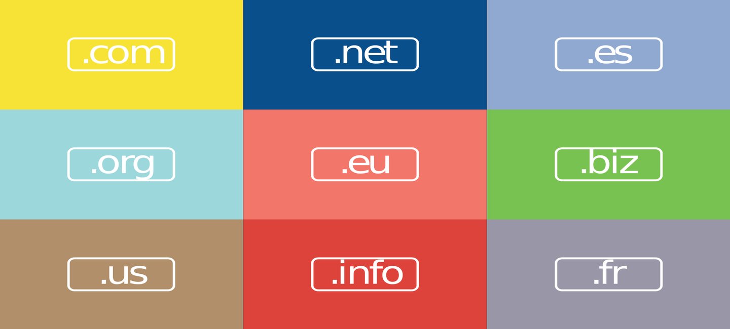
A .com extension
Business and organizations will (and should) want to register other extensions like .org or .net, or even some local geographical ones, but a .com extension is always the best way to go. It is popular and everyone is aware of it. Repeat visitors will often type in your domain name and follow it with .com.
Nothing wrong with a modern, fancy extension but you don’t want to lose potential visitors this way.

13 Steps To Building A Profitable High Traffic Technology Blog – Part five – WordPress Hosting
13 Steps To Building A Profitable High Traffic Technology Blog – Part Four – your logo

Who approved never get Hulu as an ad slogan?

13 Steps To Building A Profitable High Traffic Technology Blog – Part Three – the baby business plan

A Failure of imagination – Apple release new iPhone XR iPhone XS and iPhone XS Max
-

 Website Performance8 years ago
Website Optimization Tips – Optimizing the Order of Styles and Scripts
-

 Web Content9 years ago
How to test a copywriter
-

 Website Performance8 years ago
WordPress Performance Tips – Enable Keep Alive
-

 Research and SEO12 years ago
New Google Penguin Algorithm Update Being Rolled Out
-
 Digital Marketing Training7 years ago
13 Steps To Building A Profitable High Traffic Technology Blog – Part five – WordPress Hosting
-

 Digital Marketing Training7 years ago
13 Steps To Building A Profitable High Traffic Technology Blog – Part Four – your logo
-

 Web Content12 years ago
7 Basic Principles Of Good Writing
-
 Digital Marketing Training8 years ago
13 Steps To Building A Profitable High Traffic Technology Blog – Part Three – the baby business plan
3 Comments